Status indicators
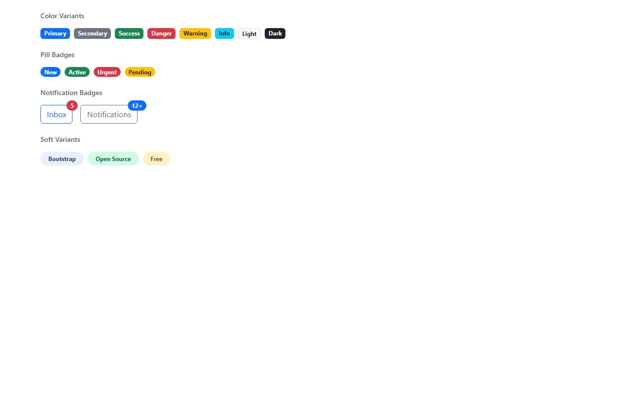
Use color consistently: green for success, amber for warning, red for errors. Pair badges with text where color alone would fail accessibility checks.
Category · 2 snippets
Labels, badges, and status indicators
Showing 2 of 2 snippets
2 results
Labels, badges, and status indicators
Use color consistently: green for success, amber for warning, red for errors. Pair badges with text where color alone would fail accessibility checks.
Yes — many snippets show badge positioning inside nav items or buttons using relative/absolute layout.
Trending now
Popular examples from the wider library while you browse this category.
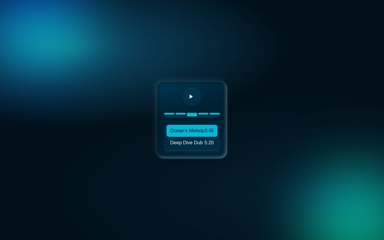
Immerse in a modern audio experience with our neumorphic music player, featuring a dynamic waveform scrubber and interactive queue visuals.
Revolutionize your AI interactions with this stunning, neon-infused chat interface. With dynamic status indicators and orbital animations, it captivates and informs.
Craft seamless schedules with an elegant neumorphic interface where you can drag and select time ranges effortlessly in a futuristic calendar view.
Trending now
Popular examples from the wider library while you browse this category.
Compact music player with album art, animated equaliser bars, scrubber, elapsed/remaining time and play controls. Pure CSS keyframes drive the EQ pulse and the neon ring around the album art.
Three-step onboarding wizard with an animated progress bar, slide-fade panel transitions and contextual hints. Forward / back nav and completion celebration.
Split SaaS hero with bold gradient headline, two CTAs, social-proof logo strip and a tilted browser mockup preview floating to the right. Built for landings.
Ranked by views and likes from the last 30 days.